Design
The identity for North Bovey Allotments: logo, palette, type scale, and the visual doctrine that governs imagery. This page is the reference; everything on the site is built from these tokens.
Logo
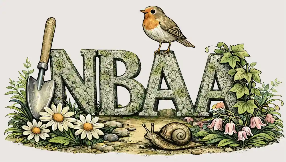 On soft background On deep background Reversed, on deep ivy
 The wordmark ships as a raster on an off-white plate, not a transparent SVG, which is why it sits awkwardly on deep ivy in the third tile. A transparent or reversed version is still needed for dark grounds.
Colour
Core
Primary accents
Structural neutral
Emotional accents
Typography
The plot runs downhill from the gate, and in the first hour after sunrise the whole of it is still in shadow. By eight the light has crossed the top beds and the frost begins to lift, one row at a time, in the order the sun reaches them.
Headings scale down on narrow screens using clamp();
the sizes above are the desktop ceilings.
Visual doctrine
Working name: Dartmoor Naturalist Realism
A hyper-real, painterly ecological style rooted in traditional British natural history illustration and Dartmoor landscape atmosphere. The tone is reverent, grounded, and quietly luminous.
Hyper-real natural history painting in Dartmoor ecological style, ground-level perspective, soft English sunlight, warm earth tones, fine botanical detail, textured soil and weathered wood, painterly realism, quiet seasonal atmosphere, no modern elements.
Every image on the site should be generated or selected against
this doctrine. Journal entries take a full-width title image at
the top of the post; see the design notes in
src/content/journal/example-entry.md.